Proposal
What is the idea of the product?
The idea I have come up with is Beard Styling Wax. This product is for men who aren’t able to shave for whatever reason (e.g in the morning or being in a rush) but still want to look good during the day. In addition to this, this product is for men who prefer to have a reasonably lengthy beard and don’t want to shave it off just to look ‘presentable’. So the idea is to assist with more efficient styling of the beard of men who don’t want to change their facial hair in the process.
What is the USP of the product?
Specifically made to be used for styling facial hair if men don’t have time to shave so, while it doesn’t have any permanent effects when used, it visually gives the impression that the facial hair isn’t scruffy. This product is made without any chemicals that are harmful to the face.
What area of Health & Wellbeing are you working in?
The area I am working in for this project is: Styling Product – Men’s grooming product. I chose to work in this area in particular because, as a male, if I was in a rush to do important business and forgot to shave the night before/woke up late so couldn’t shave, I wouldn’t want to delay any more time by
What existing companies and products exist?
There are companies that make hair wax, which some men use on their beards, so, while this kind of company isn’t intentionally creating a product that could potentially be a competitor for my company, since men use their product on their beards, then they can be considered a competitor. Since this fact lies true, when creating my USP, I took into consideration that my product would have to have something unique to it and be a much better alternative to using hair wax on their beards.
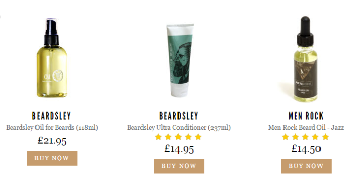
Since the product I’m making will be a styling product for men, it is only natural that it will have some competition within the market. I have found Mankind.co.uk, which is a company that produces styling products, such as beard oil and moisturisers.
Who will you target?
My target audience is mostly young male adults and men who are think of themselves as sophisticated or have a sophisticated style that they want to maintain.
What style will your corporate ID have?
The colour scheme for this product isn’t going to be bright and colourful as the types of people the product is aimed towards is going to be males and more older and sophisticated types of people, so they wouldn’t go for something that is bright and colourful as it would be viewed as childish to them. The colour scheme will be more monochrome with one single bright colour so that it will stand out against the darker background colours.
What will you produce in your campaign?
I will need to put together an advertising campaign for my product in order to advertise and promote the product.
I have decided to make a magazine advertisement as most male products shown in magazines don’t have much text, they just focus on a man and/or the product they’re trying to advertise, there isn’t much text, just quick and easy to read slogans and information to websites, company names etc.
I am also creating a poster as a poster wouldn’t need to include a lot of information on it if it is advertising a product. I am including a website at the bottom so that in itself will be enough information as the person who looked at the poster would only need to remember the name of the company and/or the website so that they can later check the website for the products that company sells.
Using Illustrator to make Logos:
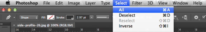
Prior to putting the image into Illustrator, the image first needs to be put into Photoshop. When in Photoshop, go to ‘Select’ and then down to ‘All’. What this does is selects the entire image, which is also known as Direct Selection. Once everything has been selected, copy the image and then paste it into Illustrator.
With the image now in Illustrator, using the Pen Tool, create anchors to make an outline around the person’s face. Also, using the Convert Anchor tool, the straight lines can be moved to make them move curved.
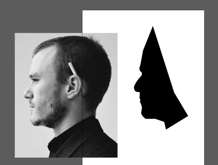
I have curved the lines around the mans nose using the Convert Anchor tool, as well as using a black coloured Fill and a clear Stroke to avoid having an outline around the black shape.
Logo Research
Before I can begin creating the logo for my product, I first need to conduct research into already existing logos for companies that produce products similar to mine. Below are a few examples of already existing logos of companies that create styling products for men.
![]()
After doing some research into current logos for male grooming products, I have noticed that they are mostly just text-based and/or only consist of one image that ties in with the name. For example, “Razrbar” uses a blade from a razor in their logo, which ties in with the name as well as what they do. Also, looking at the logo for “Mitch”, there is usually a limited amount of colours that are used within logos, usually only having black and white colours, as well as one single bright colour that stands out.
Mind Map
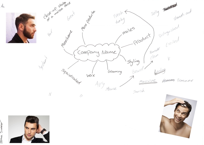
This is my mind map with words that describe my product idea, along with images that relate to the words on there, e.g. the word “Beard” has an image of a man with a beard.
I also used this mind map as a way to generate my company name, as well as my strapline.
Company Name + Strapline
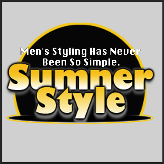
Name of Company: Sumner Style
Company Strapline: “Men’s Styling Has Never Been So Simple”
This is the logo for the company that will make the product I have created. I took some inspiration from the logo for the company “Mitch” by having one single bright colour, while also having simple colours too. I didn’t want to go overboard with the logo as logos are supposed to be simple (seen in my logo research), so having the company name look decent and recognisable, then simplicity isn’t bad.

Finalised logo
This is the finalised version the logo for my product. I from the version I first made, I changed the position of the words “Sumner” and “Style” to be placed at the bottom of the logo, while the strap line has been repositioned to the top of the logo. I have also added another ellipse at the bottom of the logo in addition to the first ellipse and a grey background to make the entire logo itself stand out.
Promotional Material
To promote my product, I have created promotional material.
Magazine Advertisement
The promotional material I chose to create was a magazine advertisement. I chose to do a magazine advertisement because magazine advertisements don’t have much text on them, they just focus on a man/the model and the product that’s being advertised.
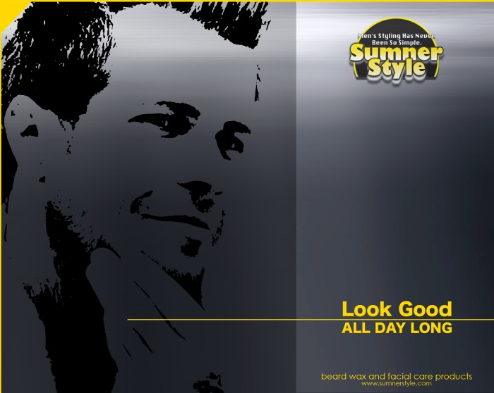
To get a range of ideas for the design I wanted for the magazine advertisement, I designed multiple and out of the five that I created, I eventually made a final decision and chose to use the fifth version. I like how the assets are arranged and how clean and modern they look, so they are not cluttering the page.


Out of five versions of the magazine advertisement, these are the four that didn’t get chosen and are the previous versions of the magazine advertisement before reaching the final version.
Poster
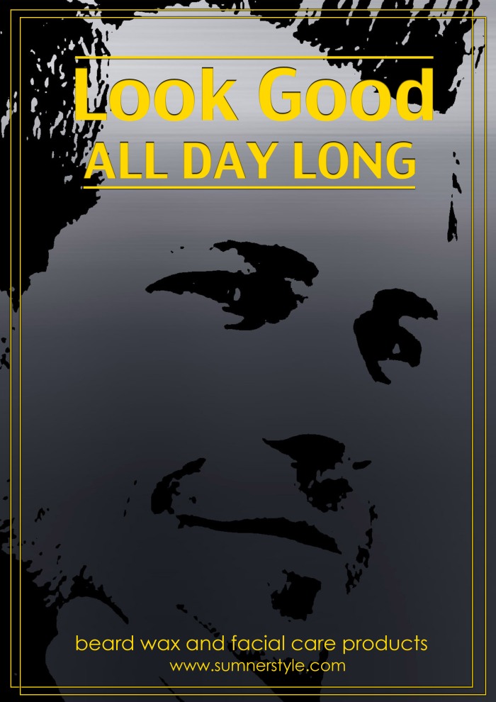
I created a second piece of promotional material. This is the poster I have created to promote my Health & Wellbeing product.
Design Context
I have kept the colour scheme of yellow, grey and black, similar to my magazine advertisement, while also keeping the man from the magazine advertisement and using it again on my poster and make him take up almost the entire poster as he is the main focus of the poster.
In addition to the colour scheme and background image, I have also made the surrounding border look different to the magazine advertisement by having two rectangles replace the border by having one overlap with the other. I wanted to retain the modern look to the promotional material, so I took various assets and styles from the magazine advertisement, while also adding in a few new things to make the designs different and look unique.
I decided to design the poster without the logo included, as, while it would have helped the viewer recognise which company made the product they could be potentially interested in purchasing, it would have made the poster appear too cluttered as there wouldn’t have been anywhere to put it without running the risk of it taking too much room and ruining the clean and modern look of the poster.
In addition to this, the text would have needed to be made smaller in order for it to fit, but that would have made the assets appear too squashed together due to the limited amount of space between each and again, would take the intended clean and modern look away from the overall design.
Layout + Text
For both my promotional material pieces, I chose to make them look more modern in terms of the layout. I also chose to make the text stand out more against the darker background so that the main focus, being the man, would be noticeable behind the yellow borders and text. I made the layout and placement of the text the way I did so that everything would be noticeable, without feeling that the text clutters the poster/magazine advertisement and isn’t too close together as they are both saying two different things.
